
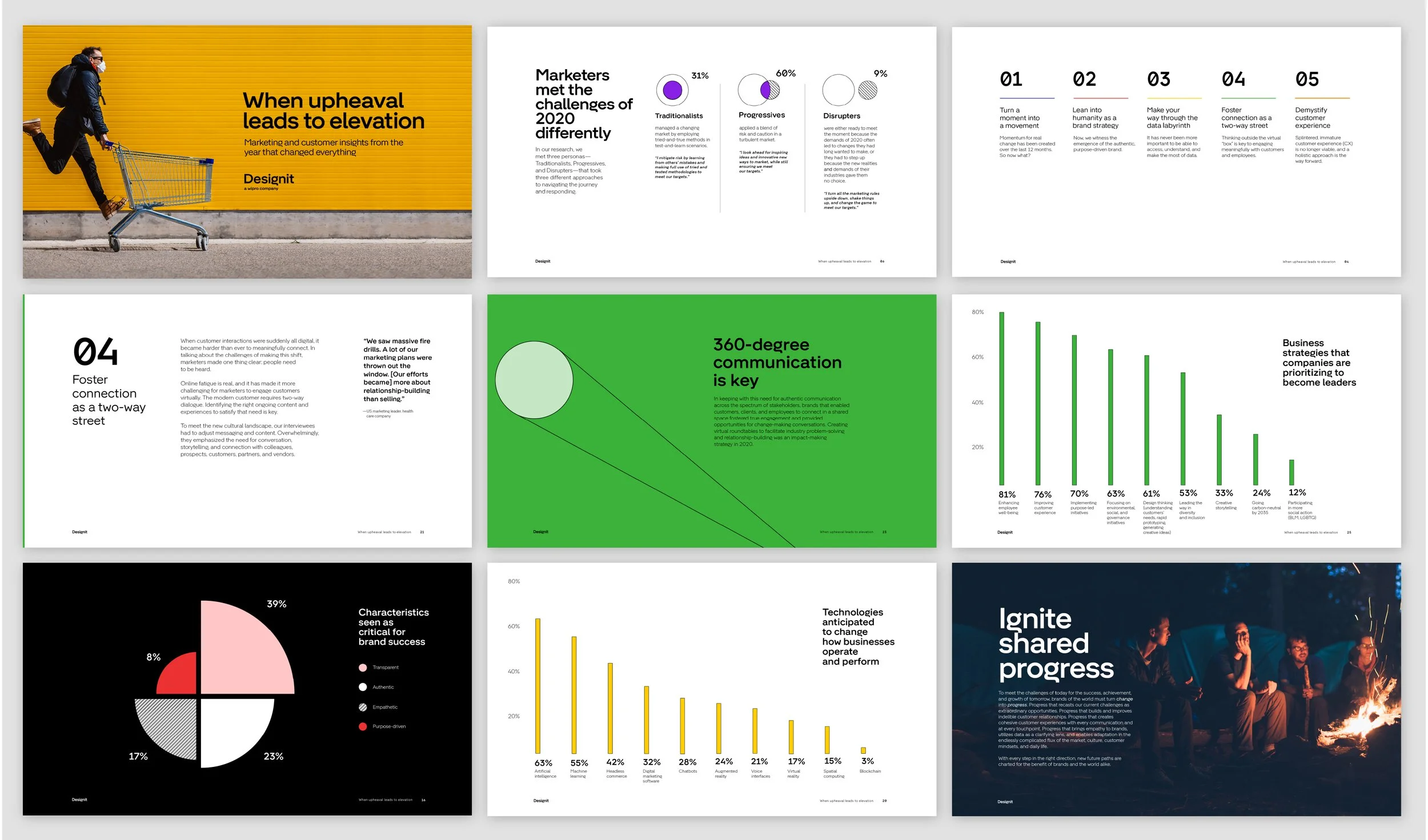


Challenge: Design a whitepaper that brings our studio’s newly developed brand identity to life, while creating a supporting mini-campaign to promote the e-book across owned social channels and the website.
Solution: We designed a user-friendly, visually engaging 40-page digital whitepaper that seamlessly integrated our new brand identity throughout the experience. The brand’s core visual language—particularly its system of basic geometric shapes—became a key design element, creating intuitive wayfinding and guiding readers through the document with ease.
Role: Art Director
To make complex research and data more accessible, we translated key findings into visual charts, icons, and graphic elements, creating a more impactful and engaging reading experience. Thoughtful use of layout, typography, color, and hierarchy helped establish a clear visual rhythm, making the content easy to navigate while maintaining a cohesive and distinctive Designit aesthetic.