


When a dear friend reached out needing a logo for her sensory, playdough-based creative workshop for kids, I happily rolled up my sleeves and got to work.
The brief was simple: create something fun, joyful, and imaginative. So I created a visual identity that captured the creativity, curiosity, and playfulness at the heart of the experience.
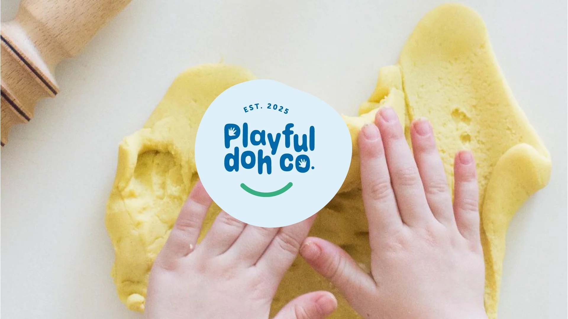
The logo brings the playful world of playdough to life through colorful, organic shapes that create a whimsical and energetic brand identity. The hand details incorporated into the letters “P” and “O” emphasize the hands-on nature of sensory play, while the subtle smile curve adds warmth and approachability. Rounded, dynamic typography reinforces the brand’s joyful personality, and the flexible playdough shapes serve as versatile visual elements that can extend across future brand touchpoints.